More Space thanks to New Spatial Designs
Author: Stephanie Kleinlein
Photography: Nils Petter Dale, Paul Paiewonsky
In Dikemark, near to the Norwegian capital of Oslo, Jarmund/Vigsnæs Architects have transformed a former nursing school dating from the 1960s into a residential complex. How do you reinvent buildings that are in danger of being demolished and give them a new lease on life by altering their spatial structure? This is a story of a project which tells the concept of space in a completely new way and looks into the future of sustainable architecture.
Anyone who wants to discover something about Dikemark and tries the standard search engines will find an entry about “Dikemark Sykehus”, the hospital of Dikemark, at the top of the list. The psychiatric hospital forms part of a hospital complex around 30 kilometers west of Oslo and takes its name from the farm on which it was built in 1905. It remains in operation to this day. In 1966, a dedicated nursing school was built on the hospital grounds. However, as the decades passed, needs changed. The dormitory and training building remained unused and were in a state of decay until the owner approached Jarmund/Vigsnæs Architects.
A building with quality and potential
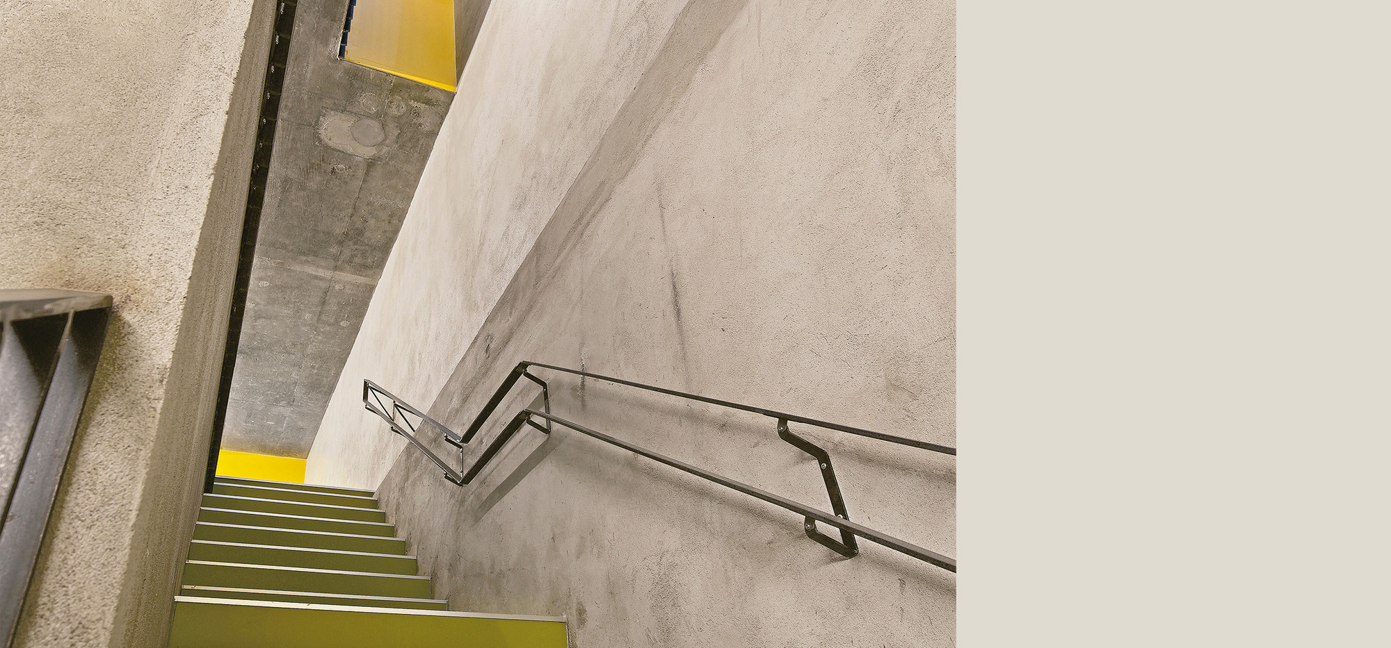
Håkon Vigsnæs, one of the lead architects, recalls his first impression of the ruin: “We quickly realized that the old building still had quality and that we could do a good job on this basis despite the fact that it had been vacant for a long time.” The aim was to preserve the significant structural features such as the floor slabs and walls made of concrete cast in-situ on the inside and facades made of red brick and steel structures on the outside, and to keep them visible. The original room layout was to be used in the
most sensible way possible, and intelligently transformed. What the architects found was in line with the pragmatism that could be expected from the time of the construction of the building and its intended use. The multi-story dormitory housed nursing students in modest single rooms arranged along the outside walls. The common areas were arranged in the center of each floor. The lower building housed large training and classroom spaces on two floors. “Each facility had the potential to be modified in its own right, without us having to make significant changes to the basic structure,” Vigsnæs says. The place where nursing students used to live, was to provide 43 attractive apartments for families, couples or individuals. With regard to the actual school building, the architects’ design envisaged several terraced houses. It was important not to increase the building volume except for a parking space, which was indispensable. For Vigsnæs, his partners and his team, these constraints were more of an incentive than an obstacle: “Working as an architect with these limitations has a merit of its own. It is different from building from scratch. You actually gain something from this transformation, which is very exciting.”
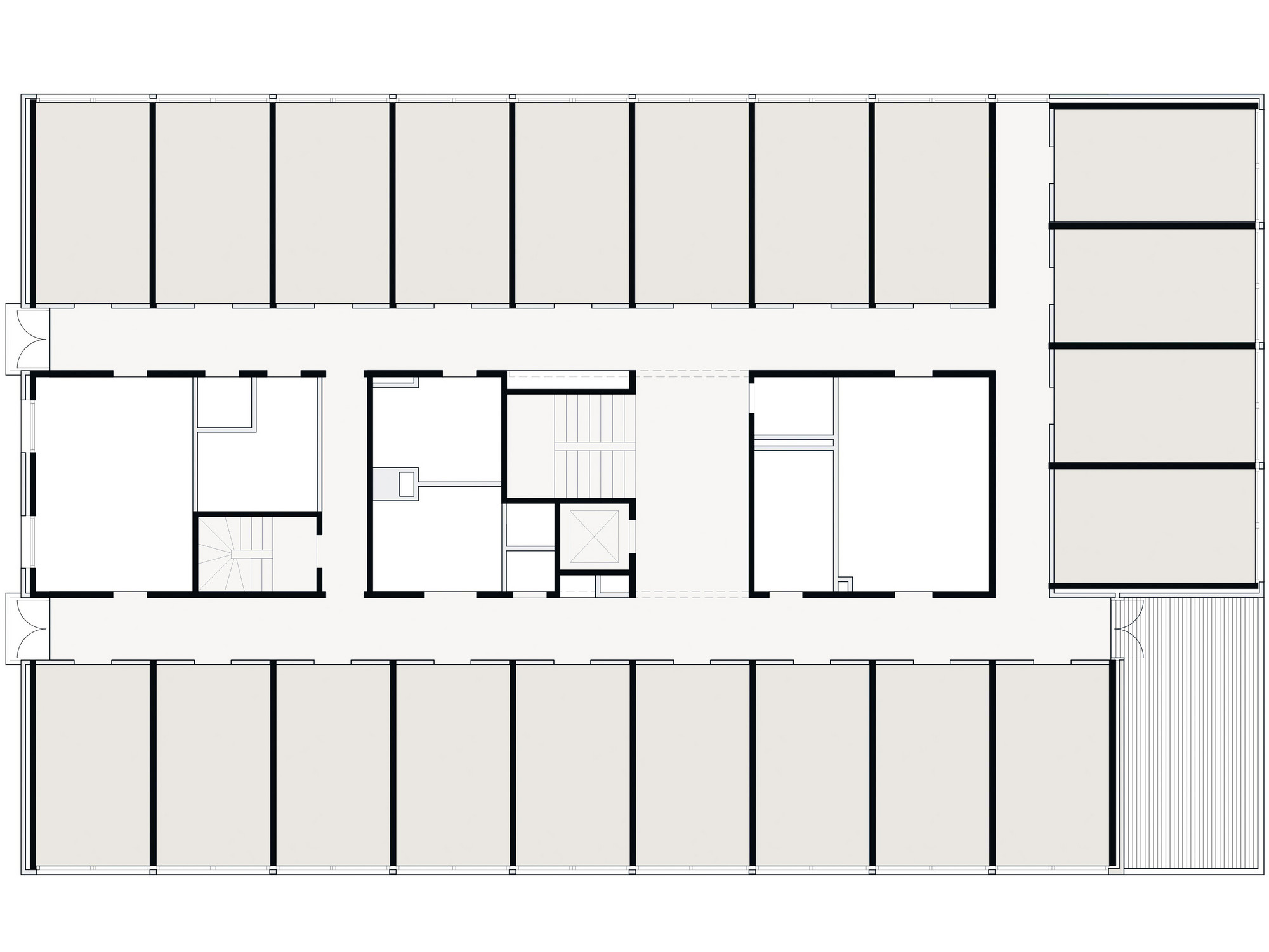
Before - original plan 1966
The nursing school, together with a dormitory for nurses, was in keeping with the spirit of the times. The students were accommodated in simple single rooms.

After - Spacious living units
The integration of sliding doors enables optimal use of space.
Modern openness thanks to new spatial designs
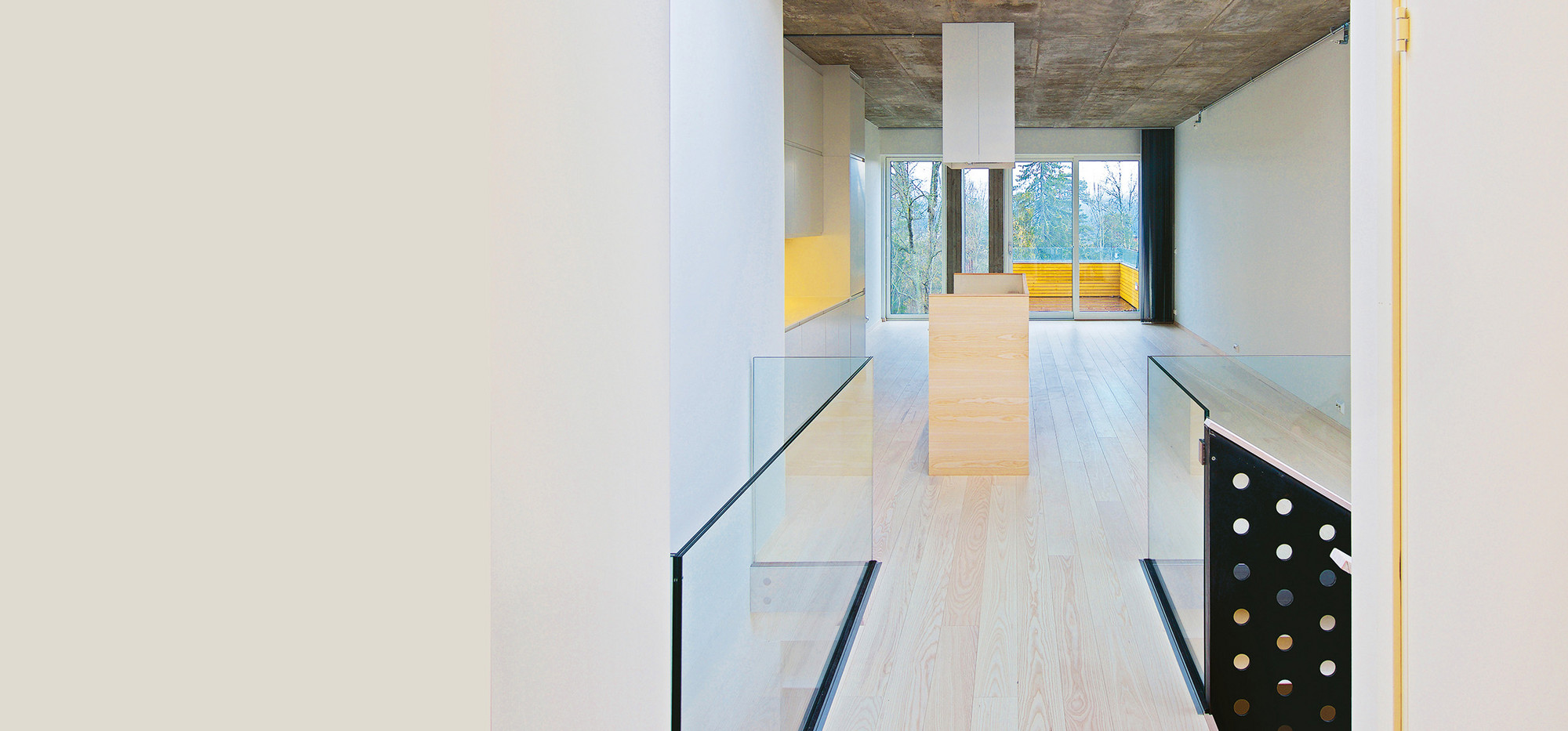
In order to turn the dormitory into an apartment complex, the builders opened up the vertical concrete slabs that were in future to form the walls of a room within a residential unit. The walls separating the individual residential units remained in place throughout. Adjustments were also made to the corridor, which was previously very long, to allow the nursing students to get to their rooms. By reducing the number of residential units, this space could be saved during the conversion and invested in making the apartments more spacious. The designers only put in new walls if they served to gain additional living space; in other places they dismantled the walls. “Wherever possible, we integrated sliding doors. After all, one of the main ideas behind our plans was to make the walls continue uninterrupted along the facade. With the doors open, this creates a very special spatial experience, which we believe is most effectively realized using sliding door solutions,” explains Vigsnæs. A significant improvement has been the enhancement of the walls, floors and doors in terms of their energy efficiency, fire resistance and acoustics.
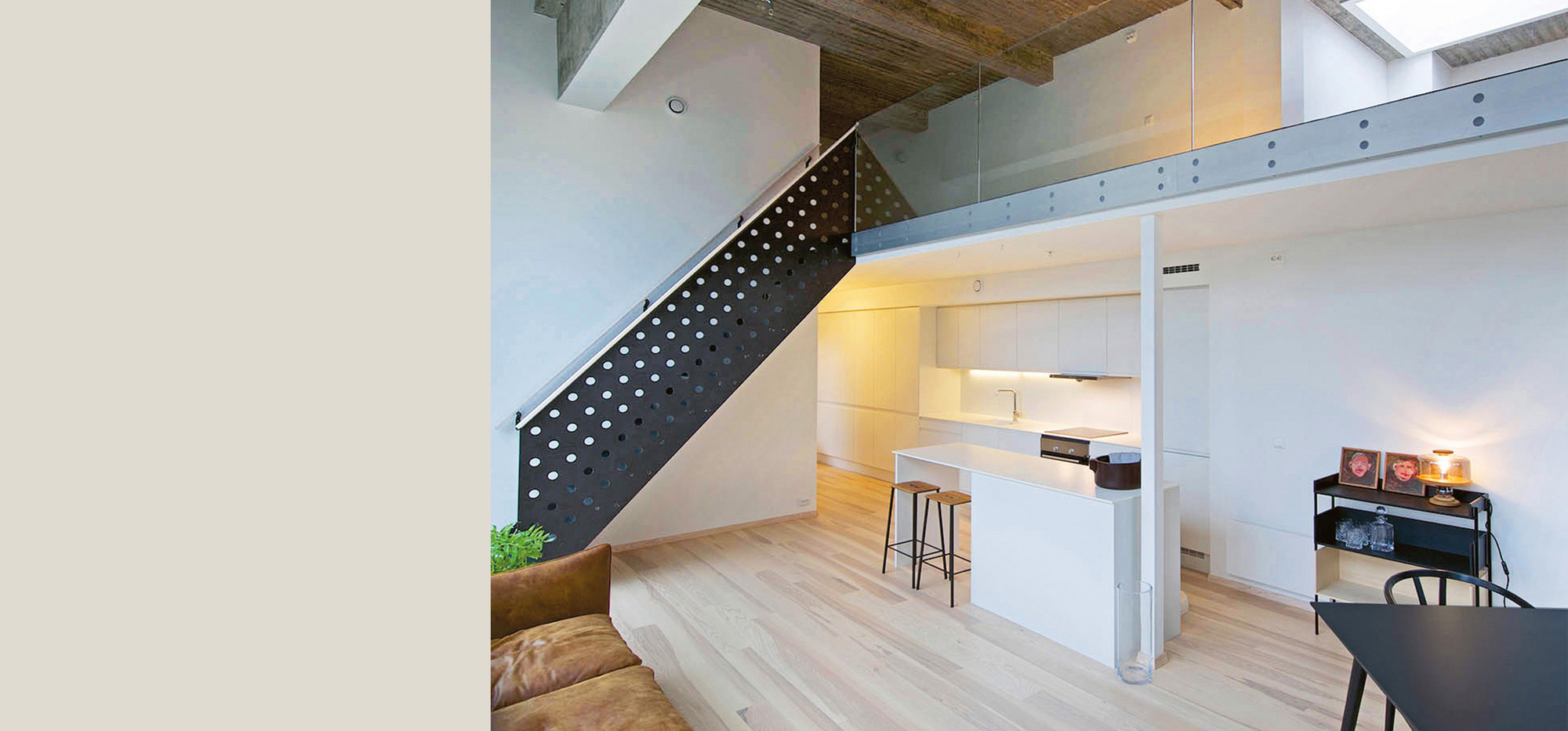
None of the structural changes affect the existing structure. The floor slabs in the former dormitory could even be used in their entirety. Only in the former training rooms where they opened up to create the necessary space in variously sized terraced houses for interior staircases and light wells. These are illuminated by a skylight and allow rooms to be twice the height.
Unobstructed view and common areas
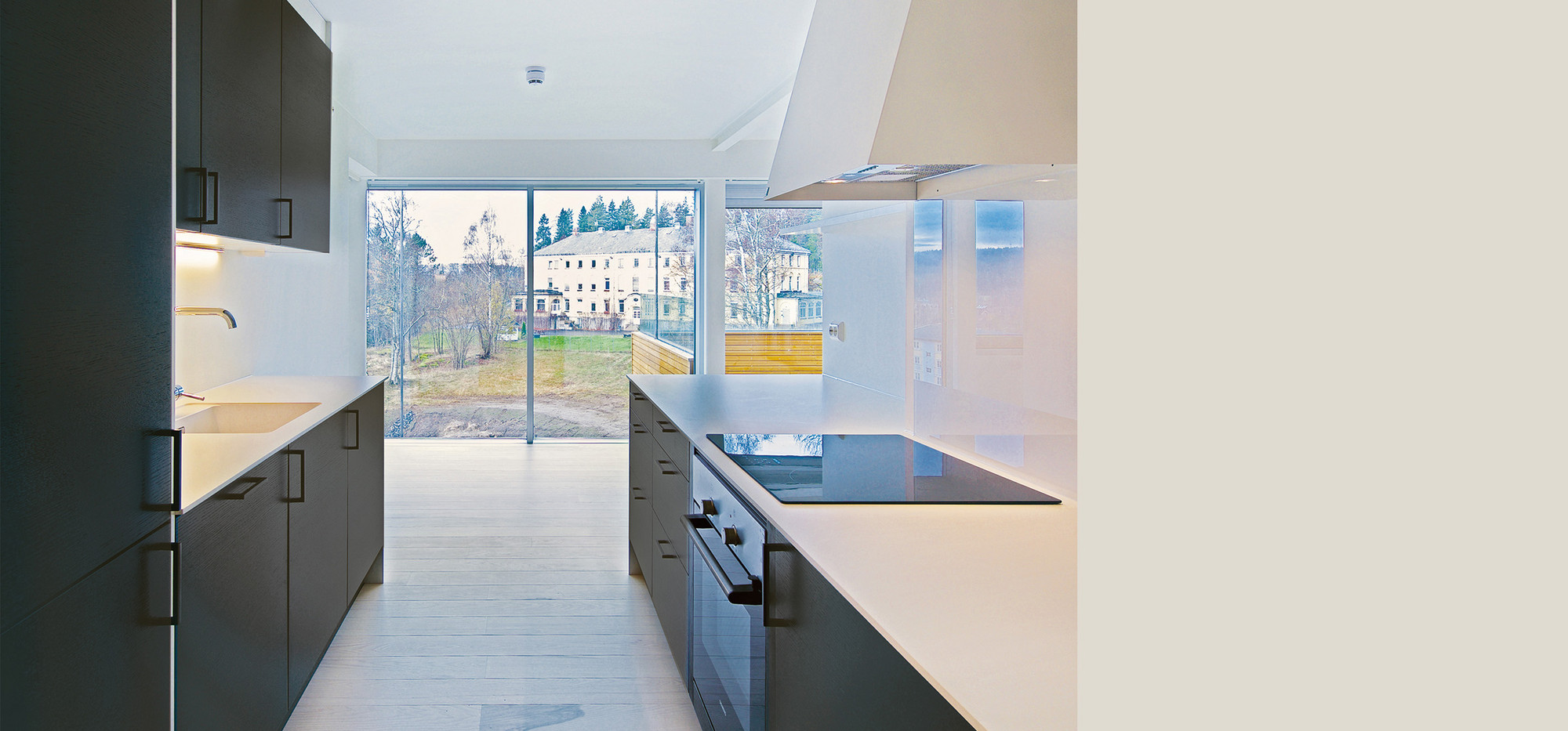
A full-length glass facade creates esthetic harmony between the exterior and interior spaces and provides a view of the unspoiled surroundings immersed in a forest. Even its installation is indebted to the qualities of the original design because, after all, it was the depth of the building that allowed windows from floor to ceiling. It also created the conditions for achieving the desired energy efficiency, as in Norway the number of square meters used for windows and doors in the external walls is limited to approximately 25 percent of the floor area.

The new facade of the high-rise building is also a reflection of the pattern of the original brick facade, whose window bands vary in height. The balconies are a new addition. However, the concrete slabs between the floors proved not to be strong enough to support them using the traditional approach. For this reason they were constructed out of wood and supported in the apartment house by the steel structure extending from the roof, which is a valuable feature from times past. The arrangement of the buildings left room for a forecourt. Once no more than just that, it is now a meeting place with communal spaces and children’s playgrounds.
Economy and sustainability
In addition to the obvious sustainability benefits that come with the new construction and redesign of existing buildings, the question of cost-effectiveness always plays a role. “Transformation,” says Vigsnæs, “must always be worthwhile.” Contrary to what is often assumed, renovating and transforming old buildings through new spatial designs is not fundamentally cheaper than building a new one. “It depends a lot on how calculations are made at the outset and how communication takes place during the course of the project,” he explains. Close cooperation between the clients, architects, builders and suppliers helps to maintain a balance between cost-effectiveness, quality, and sustainability.
Rethink and rebuild
Nevertheless, Vigsnæs recognizes a change in thinking in his industry when it comes to the preservation of old buildings: “The number of transformation projects is increasing sharply. Just three years ago, schools were being torn down here that we would today convert to other uses with the help of new spatial designs,” says the architect. The younger generation of architects and builders in particular is growing up with an awareness of sustainability that includes the use of old building fabric and the recycling of materials as well as a building design that generally enables it to be converted for other uses at a later date.
Jarmund/Vigsnæs Architects,
known today as Vigsnæs+Kosberg and Einar Jarmund & Co
The architectural firm Jarmund/Vigsnæs was founded in 1996 by Einar Jarmund and Håkon Vigsnæs in Oslo. It garnered international recognition for its buildings, which are considered super-modern and even neo-minimalist. In 2019, the architects in question reformed as Vigsnæs+Kosberg and Einar Jarmund & Co. Håkon Vigsnæs has been a visiting lecturer at Missouri’s Washington University and is on the board of the Oslo Association of Architects.
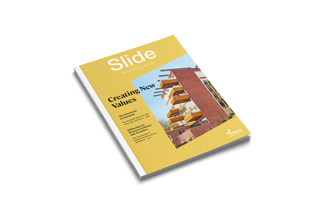
You can also find the article on "More Space thanks to New Spatial Design" in our Slide #4. In this issue of the magazine, you will also learn more about the balancing act between aesthetics and acoustics, and we will take you along with us when a barrier-free apartment is planned in Switzerland.
Order the magazine free of charge to your home or download it directly.
